How to make publication-quality Matplotlib plots
This guide is intended for Matplotlib ≥2.0; if you are using an older version, please go here.
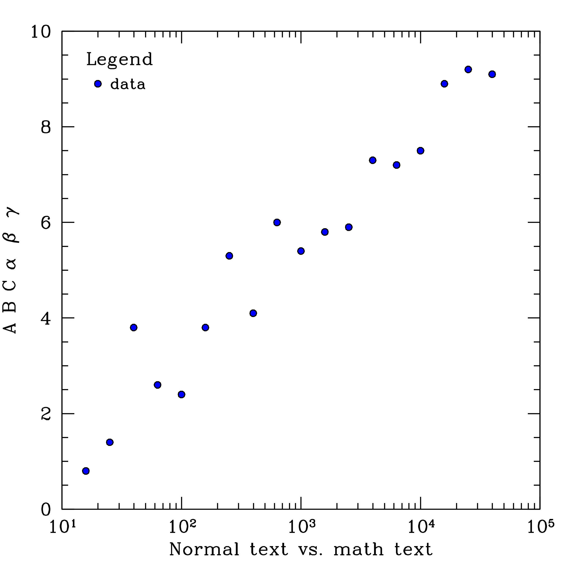
Before the days of matplotlib, astronomers often used Supermongo to generate their figures, which I find always look really great (notwithstanding the torturous path it takes to get there). For example, here is a very basic SM macro that I wrote to plot this data, and below is the resulting figure:
Alas, the same cannot be said for figures generated with Matplotlib. Although the release of
Matplotlib 2.0,
came with many improvements to the default aesthetics, it still leaves a lot to be desired.
Here is the same figure made using
this
python script and the matplotlibrc defaults:
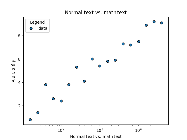
It's certainly an improvement upon this monstrosity, but a number of problems remain, including: the text size is too small compared to the other elements in the figure, there are no minor tickmarks on the y-axis, and the tickmarks are too small.
Almost everything that I found needed adjustment can be changed from one's
matplotlibrc file. This is what mine looks like:
    # Set the backend, otherwise the figure won't show up. Note that this will
    # depend on your system setup; to see which backend is the default,
    # run "matplotlib.get_backend()" in the Python interpreter.
    backend                 :  GTK3Agg

    # Increase the default DPI, and change the file type from png to pdf
    savefig.dpi             :   300
    savefig.format          :   pdf

    # Instead of individually increasing font sizes, point sizes, and line
    # thicknesses, I found it easier to just decrease the figure size so
    # that the line weights of various components still agree
    figure.figsize          :   4,4

    # Turn on minor ticks, top and right axis ticks, and change the direction to "in"
    xtick.top               :   True
    ytick.right             :   True
    xtick.minor.visible     :   True
    ytick.minor.visible     :   True
    ytick.direction         :   in
    xtick.direction         :   in

    # Increase the major and minor tick-mark lengths
    xtick.major.size        :   6  # default 3.5
    ytick.major.size        :   6  # default 3.5
    xtick.minor.size        :   3  # default 2
    ytick.minor.size        :   3  # default 2

    # Change the tick-mark and axes widths, as well as the widths of plotted lines,
    # to be consistent with the font weight
    xtick.major.width       :   1  # default 0.8
    ytick.major.width       :   1  # default 0.8
    xtick.minor.width       :   1  # default 0.6
    ytick.minor.width       :   1  # default 0.6
    axes.linewidth          :   1  # default 0.8
    lines.linewidth         :   1  # default 1.5

    # Increase the padding between the ticklabels and the axes, to prevent
    # overlap in the lower lefthand corner
    xtick.major.pad         :   4  # default 3.5
    ytick.major.pad         :   4  # default 3.5
    xtick.minor.pad         :   4  # default 3.5
    ytick.minor.pad         :   4  # default 3.5

    # Turn off the legend frame and reduce the space between the point and the label
    legend.frameon          :   False
    legend.handletextpad    :   0.0
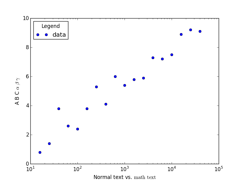
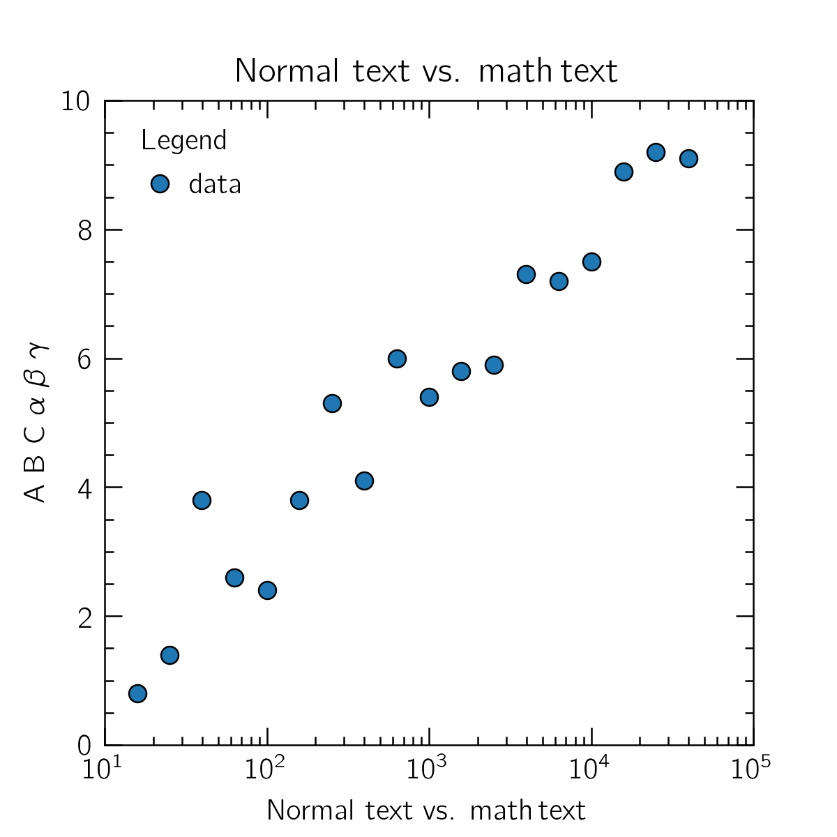
The final touch is to set the axis limits, in order to obtain the full range of ticklabels. Since this will be specific to individual figures, it should be done in the source code, and I've added it below:
    import matplotlib.pyplot as plt
    import numpy as np

    x, y = np.loadtxt("data.txt", skiprows=1, unpack=True)
    x = 10 ** x

    fig, ax = plt.subplots()
    ax.semilogx(x, y, 'o', mec='k', label="data")
    ax.legend(loc=2, title="Legend")
    ax.set_xlabel(r"Normal text vs. ${\rm math\, text}$")
    ax.set_ylabel(r"A B C $\alpha$ $\beta$ $\gamma$")

    #
    # Set axis limits
    #
    ax.set_ylim(0, 10)
    ax.set_xlim(10, 1E5)

    fig.savefig("plot.pdf")
    plt.close(fig)
Here is the result:
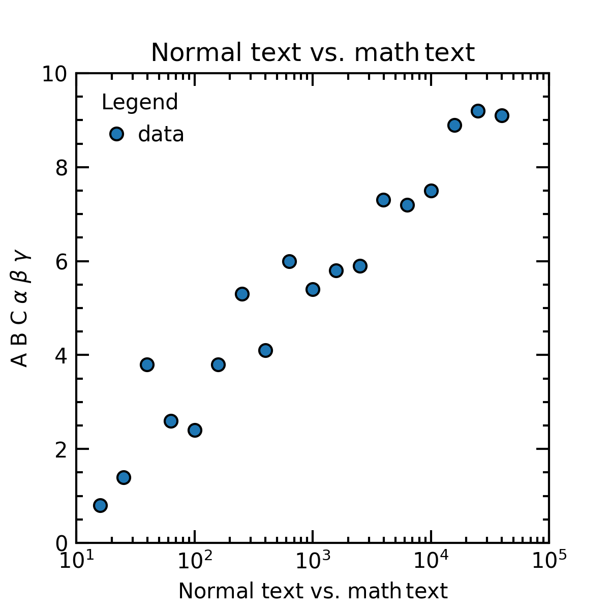
A bit better! If you're feeling brave, take a dive down the font rabbit hole with me. The default font Bitstream Vera / DejaVu Sans suffers from an unfortunate case of ugly 1's, a number that shows up a lot when you are plotting logarithmic quantities.
While the beautiful vector fonts of SM are out of reach, a great alternative is Computer Modern Bright.
Install it on your system, make sure it works in LaTeX, and then make the following changes / additions
to the above matplotlibrc:
    # Computer Modern Bright has a much lower font weight, so the tick mark and
    # line widths should be adjusted accordingly.
    xtick.major.width       :   0.6  # default 0.8
    ytick.major.width       :   0.6  # default 0.8
    axes.linewidth          :   0.6  # default 0.8
    lines.linewidth         :   0.6  # default 1.5
    lines.markeredgewidth   :   0.6  # default 1

    # The magic sauce
    text.usetex             :  True
    text.latex.preamble     :  \usepackage[T1]{fontenc}, \usepackage{cmbright}
And here is what comes out:
Finally, a huge thanks to Gabriel-Dominique Marleau who made many helpful suggestions that improved this page.